Car Data (75 points)

Maybe you’ve noticed the plethora of data on the whiteboards in the classroom of what appears to be data on the vehicles in the parking lot, and a few images in the photos of the iPads as well of the boards. Well let’s put it to use. Here you want to put together a collage of sorts of the data on the board, digitize it, and get it shown on the Friday Announcements. (this is only available to one group of two students, so first come first serve. Once it’s been claimed, it’s over*).

The task is involved though. You must ascertain the data from the boards, determine what they’re saying to you (ask me, I know), and then make 4-5 graphs of the data using the iPad. This has to be done using technology (use can use your own device if the iPads apps aren’t working for you, but it cannot be drawn and photographed). Then, show me the graph and we’ll get it on the Friday announcements where applicable.

parking-lot

To complete:

1. Find a partner, commit to doing the project and tell me you’re in.

2. Gather the data off the boards and ensure you’ve got the numbers absolutely correct and the titles of the data right as well.

3. Compile the data into graphs on a device.

4. Show me/email me the results, and we’ll work together to get them on the announcements.


*I will, however, accept this project for 25 points if the graphs are made correctly on paper, but not made to go to the announcements. The graphs HAVE TO BE done correctly, though. Scaled, labeled, accurate, all that.


Observational Study Presentation (75 points)

Wanna up the ante on points with the study? Here you go. Create a powerpoint of a minimum of 6 slides showing your observational study and its results. There should be a title slide, a slide detailing the hypothesis, one detailing the procedure, one showing what was being observed, one showing the results with data and a graph(s), and one detailing what went wrong/could have been better. And then any other relevant slides you can think of to put in are okay as well.

You would then take approximately 5-10 minutes ‘presenting’ it to our class. All I need is a one-day heads-up as to your doing this, and it’s on! When creating and presenting a Powerpoint (or a Keynote if you decide to use our iPads), beware of the unfortunate ways that have preceded your effort from other. Here are a few videos to quickly watch to ensure you get the biggest bang for your buck when creating and presenting a Powerpoint:

Both of those are silly fun, but speak the truth. Powerpoint are backdrops to you, you’re the attraction. Use them to pace and keep your audience lightly informed as you detail.

To complete:

1. Complete the observational study (obviously) and turn it in.

2. Develop a Powerpoint or Keynote using the guidelines from the videos above that is a minimum of 6 relevant slides.

3. Arrange a time to present to the class with me.

4. Present it baby!

Observational Study (125 points)

No small task here, but maybe worth your while. As we learned in class, an observational study is one in which the ‘experimenter’ takes no efforts or actions in measuring a particular variable about some subjects. The variable is defined, clear, and the study is carried out professionally, but in no way does the subject react to the administrator. Here’s a short description of an observational study in direct comparison to an experiment. Watch it to ensure you’ve got the idea of what an observational study is.


Over the years, students have had various topics for this project. Observing customers at their work in some fashion, observing patrons in restaurants, vehicular tendencies of drivers, student behavior in certain non-acrimonious regards. Lots of thoughts and ideas, and I’ve shared a few with you in class. Your task is to consider something you’d like to observe because you are genuinely are interested in what the results will tell you, write up a short outline of your potential procedure, get approval from me (a must), and then carry out the study. This can be done with a partner, but not more than that.

To complete:

1. Determine a topic(s) that you feel that you would be interested in studying.

2. Write up a short, but detailed, outline of what the plan would be in order to actually study what it it you’re proposing.

3. Get approval from me.

4. Carry out the study appropriately.

5. Compile the results in statistical form (i.e., with a graph, chart of your data, and then a written procedure and conclusion). Clearly, you should confirm with me prior to embarking on the simple write-up. Be glad to help.

6. Turn it in! This can be done digitally as well, so it can be emailed if that’s applicable.


Quizlet Cards (75 points)

A popular method of studying over the past several decades has been to use index cards as terms/definitions, where one side of the card contains the term, and the other side has the respective definition, AKA flash cards. The digital world (you know, the one you live in) has a few pretty good digital examples of this, one being quizlet, a site that allows users to create a set of index cards that can be manipulated on a technological device for any subject the student so desires. Great app, great functionality, and the task here is to use it in our look at statistical terms.

We’ve studied the practice of statistics, and we discovered that there are quite a few terms to remember in order to successfully discuss a statistical process. Your job here is to make a Quizlet set of 25 statistical terms that we learned this semester where one side of the ‘card’ is a definition, the other side is the term being defined. The app on the iPad is quite simple to use in order to make this happen. When complete, email me the result.

To complete:

1. Open the iPad and launch the quizlet app. Log in to the app using your bvsd-provided Google account.

2. Create the set (naming it something relevant) of 25 cards, terms on one side, definitions on the other.

3. When you’ve completed that, there is a ‘share’ option. Share it to me (robert.letter@bvsd.org) via the email option. Make sure when you email it to me you identify yourself in the email (like make sure it’s actually sent from your email; if it’s not, put your name in the subject line).

flash cards


Fair Division Example (50 points)

Early on this semester, we discussed what it means to fairly divide a discrete object. We investigated up to 5 individuals sharing an object, but what if the numbers were higher? Like say 30? There’s some calculating!

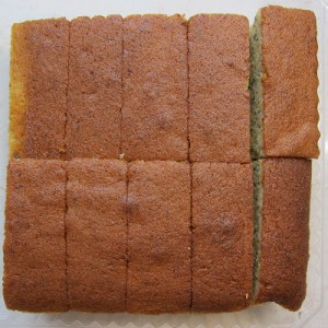
This task asks you to demonstrate if there were 15 individuals trying to share the discrete object. But in order to do it, you have to actually demonstrate it to the class. The whole process in class would most likely take in the vicinity of 15 minutes. You would be doing a few things here- actually having a discrete object that can be both cut and shared, and the mathematics demonstrated for the class as you’re doing it (on the Smartboard). If the cake division work we need came simply to you, this might be a simple task.*

To complete:

1. Determine what object you would like to use as the example that could be fairly divided (a cake or something of that sort is best, keeping in mind that it ACTUALLY needs to be shared amongst 15 i.e., it can’t be tiny). Check with me before you commit to an object.

2. Figure the mathematics behind what we did in class, then extend that to 15 individuals for the division. We got to 5 or 6. Obviously, I can help you be sure you’ve got it right, and this is a classic problem that Google probably knows about.

3. Reserve a time with me that you’ll ‘present’ this to the class. I’ll ensure that your lesson plan is adequate. The plan itself needs to be outlined in a very simple, basic way. Any form of outline will suffice- whatever floats your boat.

4. Do the presentation, where the end result is that the discrete object has actually been fairly divided, and the division matches the number detailed from your mathematical display.

You cut, I choose

You cut, I choose

* if several groups are interested in this, then it’s first come, first serve, unfortunately. Once it’s ben done, it can’t be replicated, as it would be the exact same lesson.

100 Trades (50 points)

Day trading is an idea we’re investigating this semester in regards to managing your income and investments. While it may not be the best strategy for everybody, it is worth a gander and/or an attempt in order to find out if it is worth our while. If you take day trading to high level, then achieving this task should be no problem. However, if your investment strategy has a touch more of a long term fell to it, don’t fret this task. It may just happen over time, and it may be that your investments are so powerful/worthy, that trading them isn’t in your best interests. Plenty of ways to obtain points. Play smart. But.. if you’re trading like a madman, then here ya go!

stock market floor

To complete:

1. Play our VSE (virtual stock exchange) game, making trades on a consistent basis.

2. Achieve 100 trades made

3. Show me

Tracking Expenditures Graphically (45 points)

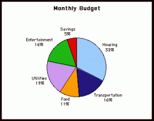
In order to truly be successful with determining how you spend your income, what’s important to you, why you have left at the end of a month what you do in terms of money, you need to see the expenditures graphically. Writing it down is just the first step. You need to then investigate where this money goes. As you begin the steps in adulthood, your spending tendencies might shift in specifics, but not categorically (most likely), so we want to categorize how we’re spending our income. This task asks you to create a ‘program’ that will allow you to put your expenditures in categories that then appear in either a bar chart or pie chart, followed by actually using what you’ve created. Here’s a visual:

monthly budget graph


Yours may appear slightly different than this (as far as the categories are concerned), but the overall idea of the display is the same- graphically categorizing and displaying your expenditures for review.

To complete:

1. Look at your expenditures and create sensible categories of how you spend (entertainment, food, beverage, gasoline, utilities, etc…)

2. Create that categorical separation in your book you’re tracking the expenditures in for easy input and calculations.

3. Using an app on the iPad (Numbers comes to mind, but you’re welcome to find an app either through the store or on the iPad currently that will work for you- just show me), crete a budget sheet that will produce either a pie chart (preferred) or a bar chart for display of your expenditures.

4. Show me

Time Magazine Interactive Graph (25 points)

Time Magazine just released their annual stats issue for our viewing pleasure. I asked you to look at these graphs and fine something about one of them that interests you. I’d like you to detail that here, if you don’t mind.

To complete:

1. Go to Time Magazine and research the interactive graphs

2. Post a comment to this blog that details which graph you found interesting, and why in just a few sentences.